AMMAN — Located in
King Hussein Park, Jordan’s
Children’s Museum uses architecture to celebrate and enrich children’s learning experiences and encourage them to explore and express their creativity.
اضافة اعلان
Prior to opening to the public in 2007, the project was part of an architectural competition organized by the office of Her Majesty Queen Rania Al-Abdullah.
Faris and Faris Architects, a Jordanian firm established by Faris AbdulRahman and Faris Zaru in 1996, was chosen to head the project. Tahhan and Bushnaq Consultants, another Jordanian architectural firm, oversaw the museum’s interior design, while British firm Haley Sharpe Design was responsible for its exhibits.
After completing the Children’s Museum in Amman, Faris and Faris Architects were commissioned to work on a similar project in Manama, Bahrain.
The design of the building engages all five senses. The building plan takes the shape of a rectangle that has been carved and subtracted from, and the museum’s most striking feature is its facade — a wall divided by three cubic protrusions and painted yellow, blue, and red.
The eco-friendly concepts hall takes the form of a spherical planetarium in the eastern corner of the
museum, while the exhibition hall is in the western corner.
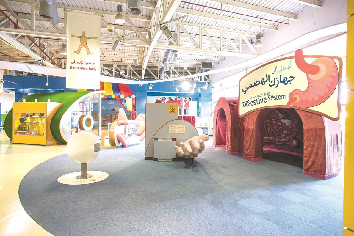
In addition to administrative and storage spaces, the museum has exhibition halls, workshop spaces, a planetarium, a library, a computer lab, a museum shop, and a restaurant. It also has an outdoor exhibit area and an outdoor theater.
Facing the street, the borders of the site feature twelve 3.5m by 1.75m concrete panels that exhibit drawing by
Jordanian children.
 (Photo: Children’s Museum Jordan website)
The museum’s designers also drew inspiration from children's games like playing cubes and the various shapes, sizes, and colors they come in. This theme can be traced inside and outside the building.
A variety of materials with different textures and colors, such as concrete, metal, aluminum, and steel, were used to make the building appear playful and vibrant.
Local stone was used for certain fronts, with color-changing fiber-optic light strips placed between the stone blocks to give the walls a dynamic look. The museum’s
designers also succeeded in making the designs sustainable and safe for visitors.
Read more Trending


