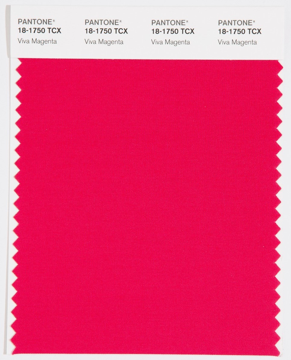
On Thursday, Pantone announced its 2023 color of the year: Viva Magenta. A hue with a lust for life. Not the aggressive synthetic of Barbie, not the intense luxury of
Valentino’s couture, not the tired millennial salmon, but as New York Times critic at large Jason Farago put it, “a saturated shade honking at the threshold of fuchsia, definitely not organic but not quite electric”.
اضافة اعلان
The shade was
selected by human trend prognosticators who survey fashion and design, then
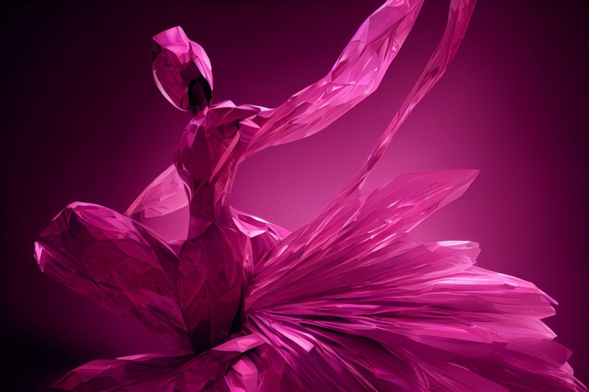
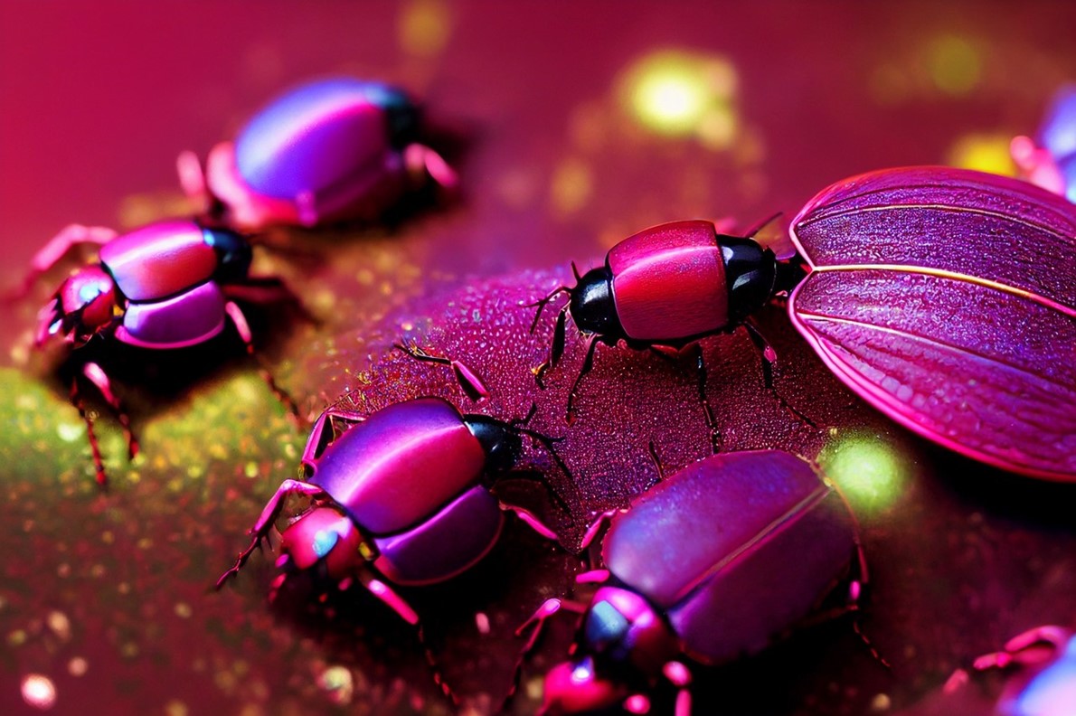
interpreted by the AI tool Midjourney to create what Pantone described as an
“endless new ecosystem to be explored, called ‘the Magentaverse.’” In a news
release, the company called Viva Magenta, aka Pantone 18–1750, “an
unconventional shade for an unconventional time.”
A few members of
the Times Styles team ventured into the magentaverse to debate the color of the
year.
 Vanessa Friedman (VF):
 The magentaverse! Let us pause for a moment to consider that word. I
wonder what
Mark Zuckerberg would say? I also wonder what you all would say.
What does it mean that this is what could define 2023?
Callie Holtermann (CH): The actual swatch of this color is so similar to TikTok’s “follow” and
“upload” buttons. AI drives TikTok’s algorithm, AI helped express the color of
the year. I guess the house always wins?
Jeremy Allen (JA): I have grudgingly got to hand it to AI: Magenta might be the only
color for 2023, a year that is going to be all about divided government,
divided everything. It is neither here nor there (“pinkish-purplish-red” is one
of Wikipedia’s definitions, and it is exactly between red and blue on the color
wheel), but it is screamingly in-your-face.
 VF:
VF: On the
other hand, Jeremy, it is also a compromise between red and blue. Which is
maybe optimistic? At least politically. Though, according to color scientists,
magenta does not technically exist, which is a less positive sign. There is no
wavelength of light that corresponds to magenta. It is simply that place where
blue fades into red.
Stella Bugbee (SB): The AI part of it feels like a gimmick gone wrong. Our ability to
think about and differentiate between colors and apply meaning to them feels
like a big part of what makes us human. Why outsource that?
CH: Like
those Dall-E images created by AI, it got the gist, but something is off in a
way that a robot might not (yet) notice, but a human would.
JA: As a
designer of the print section on this desk, I have no doubt my job will be
replaced by an algorithm in, what, five years? (It was wonderful working with
you all!) But the lo-fi-ness of it all is one of the reasons I love magenta: It
is not so secretly one of the cornerstones of color printing — the M in CMYK
(cyan, magenta, yellow, black). When something looks too red on a proof, we ask
to reduce magenta, not, in fact, red. It is a subtractive primary color, which
means it never really gets its due. But what would we do without it?
SB: What do
we make of the “Viva” of it all? Especially since Midjourney, its chosen
interpreter, has a distinct lack of “viva”?
Louis Lucero II (LL): Like the shade itself, it seems to insist that we be excited about it,
but I am coming up blank on a reason we should. It is not a color that you want
to live with in any meaningful way, is it?
 Jessica Testa (JT):
 The Jennifer-Coolidge-as-Tanya-in-“White Lotus” of colors. It is
standing at the breakfast bar of the five-star Italian resort asking for Oreo
cookie cake.
JA: It almost
feels like the millennial pink of yesteryear run through an algorithm to make
it feel “post-pandemic” — that kind of Roaring Twenties redux.
JT: That is
the thing about these Pantone announcements; they explain their choices by
making sweeping generalizations about the mood of the world. I remember in
2019, they chose “classic blue” as a response to everyone feeling “completely
overloaded and perpetually stressed.” Pre-pandemic! If only they knew!
VF: So here’s
another question: Would you wear it?
JT: Not for
me. Though I will say the idea of wearing this shade of pink appeals more to me
right now than wearing muted pink — say, millennial pink.
VF: Pantone
identifies it as a “hybrid color,” or “a carmine red that does not boldly
dominate but instead takes a ‘fist in a velvet glove’ approach.” They also say
it “welcomes anyone and everyone.” But it is interesting that most of us think
of it as closer to pink than red.
LL: Pink is a
fact of life, and it does feel that the brash maximalism of Ms. 18–1750 suits
our current moment much better than a more restrained cotton candy or carnation
shade.
CH: Somebody
tell the AI that this color would wash me out!
SB: The AI
does not love us, Callie!
JA: The AI
knows that this shade will make your avatar pop in the metaverse.
CH: Can you
imagine the Zuckerberg avatar wearing this color? I am going to be underdressed
for the magentaverse.
VF: Actually, imagining the Zuckerberg avatar in the
magentaverse fills me with cheer. It is a step up from those gray T-shirts,
anyway.
Read more Odd and Bizarre
Jordan News


