From pocket-stretching smartphones to
wall-hogging TVs, people have often asked: How much screen is too much?
The question has come to today’s
gadget-stuffed cars, whose increasingly colossal screens are splitting opinions
among designers, car buyers, and industry critics. These do-it-all touch
screens, the nerve centers of many new cars, have sparked a backlash because of
their size, as well as the clunky interfaces that may take eyes off the road.
اضافة اعلان
“I think we’ve reached Peak Screen,” said
Klaus Busse, Maserati’s head of design, who previously led design for Alfa
Romeo, Fiat, and Lancia. “Screens have their right of existence — they do a lot
of things better than physical switches. It’s just been pushed a little too
far.”
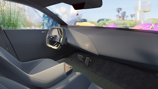
 A rendering of BMW’s iVision Dee, a car that is not
yet on the market.
Beyond having ergonomic and safety
concerns, some luxury designers object on aesthetic grounds. To them, screens
just are not attractive or luxurious.
“When flat screens showed up,
the-bigger-the-better was the trend,” said Kai Langer, head of design for BMW
i, the automaker’s electric division. “But ‘bigger’ isn’t always the richest.”
Screen technologyScreens are now integral to most modern cars,
which are more or less rolling supercomputers, running up to 14 times more code
than a Boeing 787. And designers must keep in mind the demands of car owners
who expect that their Apple or Android smartphones will hook up flawlessly.
“Steve Jobs changed the world, and now
mankind touches a screen,” said Gorden Wagener, chief designer for
Mercedes-Benz. “That fundamentally changes the car as well. The car needs a
good interface, not just a wiper switch and turn indicator.”
When Elon Musk unveiled the Tesla Model S
in 2009, the command center, with its 17-inch LCD touch screen, seemed nearly
as game-changing as the car itself. And in giving drivers digital control of
automotive functions, Tesla was able to avoid the expense of engineering,
wiring, and building a cabin full of pricey analog switches, knobs, and gauges
— or having to buy them from another automaker or supplier.
“Steve Jobs changed the world, and now mankind touches a screen. That fundamentally changes the car as well. The car needs a good interface, not just a wiper switch and turn indicator.”
In Tesla’s bare-bones Model 3 and Model Y
especially, one might suspect that interior designers worked overtime on their
ingenious screens and then called it a day. A number of Tesla’s competitors
mimicked the cabins’ austere, vaguely sci-fi vibe.
The creators of later electric vehicles —
including BMW’s futuristic yet sumptuous iX and the Kia EV6 — came up with warmer
car interiors better suited to drivers who may not want to feel as if they are
spending hours inside the mainframe from “Tron”. Some designers are even
ditching that most played-out of EV tropes, the Mac-like monochromes of
gray-silver-white.
From ‘Hyperscreen’ to windshieldWith its expanded touch screen, Tesla also
spurred an arms race measured in centimeters. Ford stuffed a 40-cm screen into
its Mustang Mach-e and F-150 Lightning EVs. The startup Rivian has installed a
40.5-cm display in the R1T and R1S models. Another California company, Lucid,
created a 85-cm, curved-glass screen for the Air sedan.
And then there is the “Hyperscreen”, from
Mercedes-Benz.
Powered by eight processors, framed under a
sculptural slab of double-coated glass, the Hyperscreen (actually three screens
that appear as one) spreads 142cm of digital interface across the dashboard.
Augmented-reality navigation generates virtual street signs and directional
guides over the pavement in a real-time camera view. Almost magically, virtual
address numbers hover over homes and businesses as you approach a destination.
Yet the Hyperscreen does not always work as
elegantly as it looks — especially when drivers are, well, driving. Issues
include fussy thumb-pad controls on the steering wheel and moments of
hair-pulling confusion, especially for customers who grew up with pre-digital
rides. Wagener said Mercedes intentionally launched Hyperscreen in its electric
vehicles to aim it at tech-savvy customers.
“Let’s use the biggest display we already have in a car, which is the windshield.”
BMW is no stranger to screens, having
ushered in iDrive more than 20 years ago on the 7-Series sedan. That digital
operating system, with a now-quaint 16.5-cm screen atop the dashboard,
infuriated many drivers because it was so hard to use. But as BMW refined it
over the years, rival car companies adopted similar systems.
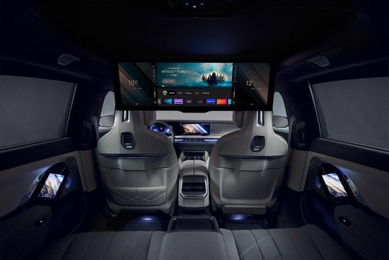
 Back-seat passengers in BMW’s i7 sedan can
watch movies on a 79-cm screen.
The i7 sedan, a new electric model from
BMW, wraps a curved screen around the driver. The back of the car offers a
79-cm, fold-down theater touch screen, with 5G connectivity and Amazon Fire for
streaming. Another 14-cm screen nestles into each rear armrest.
At the annual CES in Las Vegas in January,
BMW threw down that gauntlet by going well beyond the touch screen. In the
iVision Dee, a concept sedan that previews a range of BMW “Neue Klasse” EVs —
the first scheduled to arrive in 2025 — the windshield itself takes the place
of a dashboard touch screen.
“Let’s use the biggest display we already
have in a car, which is the windshield,” Langer said.
“A touch screen doesn’t speak to our senses,” Langer said. “We’re made to touch fabrics and sense different surfaces, that’s what makes us human.”
The augmented-reality windshield allows for
“Minority Report”-style projections of traditional gauges (speedometer;
temperature settings; audio displays) and social-and-streaming content. The
system, which BMW will call Panoramic Vision on showroom models, greatly
expands the head-up displays that project content into the field of view,
allowing drivers to check the controls without looking away from the road.
For those leery of astral projections
blocking their view of I-95, Langer said drivers could choose any display
level. A “mixed reality slider” can limit traditional information, such as a
speedometer, to a thin strip of lower windshield, where today’s head-up
displays operate. Drivers more at ease with digital projections can fill more
of the windshield glass with content. When the car is not moving, including
during charging stops, passengers may eventually use the entire windshield like
a virtual drive-in for movies, games, Zoom meetings, or trips to the metaverse.
If touch screens shrink or even disappear from
cars’ cabins, designers will be free to reclaim the interiors for something
more aesthetically pleasing. “A touch screen doesn’t speak to our senses,”
Langer said. “We’re made to touch fabrics and sense different surfaces; that’s
what makes us human.”
Read more Drive
Jordan News


